Barcharts are more than just a visual representation of data; they are powerful tools that can help us interpret complex information quickly and efficiently. Whether you’re analyzing sales figures, survey results, or any other type of categorical data, barcharts can simplify the process and enhance your decision-making. In this article, we will explore everything you need to know about barcharts, including their types, uses, and how to create them effectively.
What is a Barchart?

At its core, a barchart is a graphical representation of data where individual bars represent different categories. Each bar’s length or height is proportional to the value it represents, making it easy to compare different categories at a glance. Barcharts can be displayed vertically or horizontally, depending on the nature of the data and personal preference.
The beauty of barcharts lies in their simplicity. They break down complex datasets into digestible visuals, allowing even those without a statistical background to understand trends and differences. For instance, if you were to analyze the sales performance of different products, a would clearly show which products are performing well and which are not.
Types of Barcharts
When it comes t, there are several types that serve various purposes. Understanding these types can help you choose the right one for your data representation needs.
Vertical Barcharts
Vertical barcharts are perhaps the most common type. In this format, categories are represented on the horizontal axis, while values are displayed on the vertical axis. This orientation is particularly effective when comparing a few categories, as it provides a clear and straightforward view of the data.
For example, if you’re comparing the number of units sold for three different products, a vertical barchart allows you to see the differences in sales quickly. However, if you have too many categories, the bars can become cramped, making it difficult to read. In such cases, a different type of barchart might be more effective.
Horizontal Barcharts
Horizontal barcharts are a great alternative, especially when dealing with numerous categories or long category names. In this format, the categories are displayed on the vertical axis, while the values extend horizontally. This orientation often makes it easier to read long labels and compare values across many categories.
For instance, if you’re analyzing survey results from various demographic groups, a horizontal barchart allows for easy comparison without the clutter that can occur in vertical formats. The choice between vertical and horizontal really boils down to the nature of your data and your audience’s needs.
When to Use Barcharts
Barcharts are versatile and can be applied in various scenarios, but knowing when to use them is crucial for effective data representation. One of the primary situations for using is when comparing different categories.
Imagine you’re a business analyst looking at quarterly sales data across different regions. A barchart would allow you to quickly identify which regions are performing well and which ones need attention. It visually represents differences in magnitude, making it easier to derive insights that can inform business strategies.
Another situation where barcharts shine is in displaying survey results. Whether it’s customer satisfaction ratings or employee feedback, barcharts can present the data in a way that’s easy to digest. For example, if you’re conducting a survey on preferred work-from-home benefits, a can showcase how many respondents prefer various options like internet stipends, ergonomic furniture, or flexible hours.
How to Create Effective
Creating an effective isn’t just about throwing some data together. It involves thoughtful design and attention to detail to ensure that the chart communicates your message clearly.
Choosing the Right Software
Before you can create a, you need to decide which software or tools to use. There are many options available, from simple spreadsheet applications like Microsoft Excel or Google Sheets to more specialized data visualization tools like Tableau or Power BI. Your choice will depend on your needs, the complexity of the data, and your comfort level with the software.
If you’re new to data visualization, starting with Excel or Google Sheets is a good idea. They offer straightforward functionalities for creating, and you can easily adjust settings to fit your needs. As you become more comfortable, you might explore more advanced tools that offer additional features and flexibility.
Data Preparation
Before you dive into creating your, it’s essential to prepare your data. This includes cleaning the data by removing duplicates or errors, ensuring consistency in naming categories, and organizing your data into a clear structure. If your data is messy, your will be, too, and that can lead to misinterpretations.
Once your data is clean, categorize it logically. For example, if you’re visualizing sales data, group your products in a way that makes sense—perhaps by product type or sales region. The clearer your categories, the more effective your will be.
Best Practices for Designing
When designing your, keep a few best practices in mind to ensure clarity and effectiveness.
Keep It Simple
One of the most critical aspects of a good barchart is simplicity. Avoid clutter by limiting the number of categories and data points you include. If you have too much information, it can overwhelm your audience and detract from the main message. Aim for a clean and straightforward design that highlights the key takeaways.
Incorporate whitespace effectively to separate different elements of your chart. This can enhance readability and help guide your audience’s attention to the most critical parts of your data. Remember, less is often more in data visualization.
Use Colors Wisely
Color can play a significant role in the effectiveness of your. Use a limited color palette to avoid overwhelming viewers, and ensure that colors have a purpose—whether it’s distinguishing between categories or highlighting specific data points.
Consider using color gradients to represent value changes within a category. For example, a showing customer satisfaction ratings could use a gradient from red (low satisfaction) to green (high satisfaction), allowing viewers to quickly gauge the overall sentiment. Just be cautious with color choices, as some combinations may be difficult for color-blind individuals to interpret.
Interpreting
Understanding how to read is just as important as creating them.provide a visual comparison of different categories, and knowing what to look for can help you derive meaningful insights from the data.
Look for Trends
When you view a, the first step is to look for trends. Are there any noticeable increases or decreases in the data? For instance, if you’re looking at monthly sales figures, you might identify a pattern where sales spike during the holiday season. Recognizing these trends can inform future strategies, such as increasing inventory during peak times.
Compare Categories
excel at allowing comparisons between categories. Take note of the height or length of each bar relative to others. This comparison can reveal which categories are outperforming or underperforming. For example, in a comparing customer feedback on various products, you can quickly see which products received the most positive responses and which ones need improvement.
Common Mistakes to Avoid
Even experienced data visualizers can make mistakes when creating. Here are some common pitfalls to watch out for:
Misleading Scales
One of the most significant errors is using misleading scales. If the vertical or horizontal axis does not start at zero, it can exaggerate the differences between categories, leading to misinterpretation. Always ensure your scales are clear and accurate to maintain the integrity of your data.
Overcomplicating the Design
Another mistake is overcomplicating the design of your. Adding too many colors, 3D effects, or unnecessary elements can distract from the data. Remember that the goal is to present information clearly, so keep the design as straightforward as possible.
Advanced Techniques
Once you’re comfortable with basic, you might want to explore advanced techniques to enhance your data visualization further.
Stacked
Stacked allow you to display multiple data series within a single bar. This technique is beneficial when you want to show how different segments contribute to a total. For instance, if you’re analyzing total sales by product category, a stacked can show how much each product contributes to the overall sales figure.
While stacked can be informative, be cautious; they can become cluttered and difficult to interpret if there are too many segments. Use this technique sparingly and ensure your audience can easily understand the information presented.
Grouped Barcharts
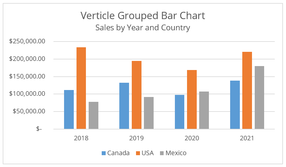
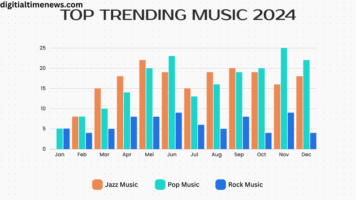
Grouped barcharts, or clustered barcharts, display multiple bars for each category side by side. This format is useful when you want to compare subcategories within each category. For example, if you’re comparing sales performance across different regions, you could use grouped barcharts to show sales figures for each product line within those regions.
Like stacked barcharts, grouped barcharts can become cluttered if there are too many categories or subcategories. It’s essential to balance the amount of data you present and the clarity of your visualization.
Real-World Applications of Barcharts
Barcharts are utilized across various industries for a wide range of purposes. Their versatility makes them an invaluable tool for professionals in many fields.
Business Analysis
In the business world, barcharts are frequently used to visualize sales data, marketing performance, and financial metrics. For instance, a marketing team might use barcharts to compare the effectiveness of different advertising campaigns, allowing them to allocate resources more effectively.
Moreover, executives often rely on barcharts to present performance metrics during meetings. The visual nature of barcharts makes it easier to communicate complex information, facilitating informed decision-making.


